Nikka Estefani
Category: Design Tips

When it comes to designing user interfaces (UI), color plays a crucial role in setting the tone, creating a mood, and communicating information to users. Choosing the right colors can make or break a design, as colors have the power to evoke emotions and influence behavior. Here are some color rules for UI design that will help you create visually appealing and effective designs.
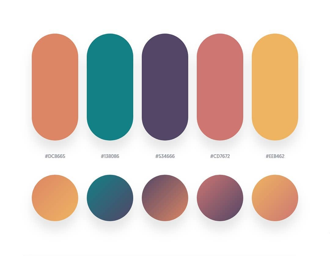
Use a limited color palette
Using too many colors can make your UI design look chaotic and overwhelming. Instead, stick to a limited color palette of two to five colors. Using a limited color palette will help you create a cohesive and consistent design.
Choose colors that align with your brand
The colors you use in your UI design should align with your brand’s color palette. Consistency is key when it comes to branding, and using the same colors across all platforms will help users recognize and remember your brand.
Use contrast to create visual hierarchy
Using contrast is an effective way to create visual hierarchy in your UI design. By using contrasting colors, you can draw attention to important elements and make them stand out. For example, you can use a bright color for a call-to-action button to make it more noticeable.
Consider color psychology
Color psychology is the study of how colors affect human behavior and emotions. When choosing colors for your UI design, consider how different colors may impact users. For example, blue is often associated with trust and professionalism, while red can evoke excitement and urgency.
Use accessible colors
Accessibility is an important consideration in UI design. Make sure the colors you choose have sufficient contrast to make them readable for users with visual impairments. You can use tools like WebAIM’s color contrast checker to ensure your colors meet accessibility standards.
Test your colors
It’s essential to test your colors to see how they look on different screens and in different lighting conditions. Colors can appear differently on different devices, so it’s important to test your design across multiple devices and screen sizes.
Conclusion
In conclusion, color is a powerful tool in UI design. By using a limited color palette, choosing colors that align with your brand, using contrast to create visual hierarchy, considering color psychology, using accessible colors, and testing your colors, you can create effective and visually appealing designs that engage and delight users.


