Nikka Estefani
Category: Design Tips
Design that looks good and works well is a key part of UX. Art gives us something beautiful to look at, and good design does this while also serving a purpose.
A strong design gives users something that is both appealing and useful. And even though a great book cover or movie poster might look like a wild piece of art or a wild splash of creative genius, it will be governed by a strict set of rules: the principles of design.
Design Principles
A design principle is a rule that says how things should look on the page or screen. Working together, these design principles are what you need to make things that are both useful and nice to look at.
These rules work in the background to make sure that a design is stable, balanced, and gets its message across. All of this while still letting the images stand out.
Here are the 7 Key Principles of Design
- Balance and alignment
- Contrast
- Emphasis
- Movement
- Proportion
- Repetition
- Blank space
- Key takeaways
Balance and alignment
Alignment and balance refer to how the design elements in your piece are spread out and fit together. Alignment and balance are important parts of UX design because they add structure and make things easier to read.
All design has meaning, which can be seen in the size, number, texture, or color of an object.
It seems wrong when all of the pepperoni is on one side of the pizza. In the same way, if all the heavy things in your work are in one corner, it will look strange and off-center.
By putting elements on both sides of an imaginary center line, symmetrical design is more balanced.
If this seems too square or boring, you can make the piece more interesting by putting different things next to each other in different parts of the page. In this painting by Henri Matisse, Dance, there is one large object that is balanced by many smaller ones.
This kind of design can also help the design movement (more on that later).

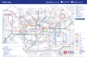
The London Tube Map is a great example of how to line up and balance a system that is known for being crooked and uneven.
Contrast
Contrast is a design principle that is often used to talk about stark or contrasting pairs of colors. It can also mean fonts, shapes, and other things that give your design space and make it stand out.
Contrast always makes your design elements “pop,” or jump out of the page and get the reader’s attention. This popping effect is important for UX design because it can be used to draw the user’s attention to things they want to see, keeping them on track.
You can create contrast by choosing colors that go well together (find out more in this article about color theory and color palettes).
A well-chosen typeface can also make the subject matter more interesting.

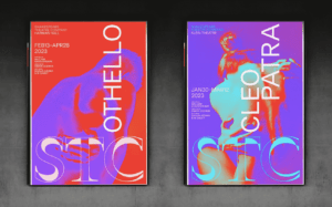
The modern rebranding of the award-winning Shakespeare Theater Company in Washington, D.C., uses contrast in the form of fluorescent colors and different fonts to great effect:
Emphasis
Emphasis is a very important part of design because it tells the reader which parts are most important. This is a very important part of UX design; if you don’t highlight important parts the right way, you risk confusing your users and losing them.
If you focus on a slogan or image in your piece, it will become the main point of interest and draw the reader in. This (often short) moment of attention is your chance to explain what your product is all about.
If you focus on a part of the design that doesn’t mean much or isn’t important, you might miss this brief chance to tell the story of your product.
There are many ways to put the focus on something, such as:
- Scale (larger = more important)
- Positioning (central vs. peripheral) (central vs. peripheral)
- Using color or texture to stand out
- There are lines and arrows.
- Underline or bold
To put it simply, a good design needs to have a clear message that stands out.
In this area, classic Sainsbury’s packaging from the 1960s and 1970s was especially good:

Sainsbury’s cat food ads use the principles of design, emphasis, and placement.
Movement
Moving on from the principle of emphasis, the design principle of movement is about how the reader’s eyes move around the page.
If the title is the most important part of a book, how do you get the viewer’s attention to the second most important part, like the name of the author?
Engaging, smooth transitions from one element to the next make it possible to build a story around the design.
On the other hand, if the user gets lost or doesn’t know where to look, this indicates a lack of movement, and the audience is likely to miss the point of the message.
This is almost twice as important when it comes to UX design. With good movement, the user’s attention will be able to follow a logical path through a lot of moving pages and elements.
Lines that lead from one focal point to another can give a design a sense of movement. Sweeps of color and diagonal or curved lines tend to add movement, which takes the eye on a journey.
Images of moving objects or repeated sets of images that change, like a horse in a zoetrope, give the brain the feeling that something is moving. If you use these tips to your advantage, people will find all the parts of your design easily and in the right order.
This is shown by the logo for Cern and the movie poster for “Vertigo.”
Using the movement principle, Cern’s blue and white logo was made.

Proportion
Proportion is a design principle that talks about the size and weight of different parts of a design and how they fit together.
Think of your essay as a collection of separate parts, not as a whole. If it’s the right size, these parts will be placed and ranked in a way that makes sense and shows good visual hierarchy.
In UX design, proportion can be thought of as the result or sign of good alignment, balance, emphasis, and contrast.
Miller’s Law is also a good way to figure out proportions in UX. Miller found that putting large amounts of information into separate groups, or “chunks,” made it easier to understand.
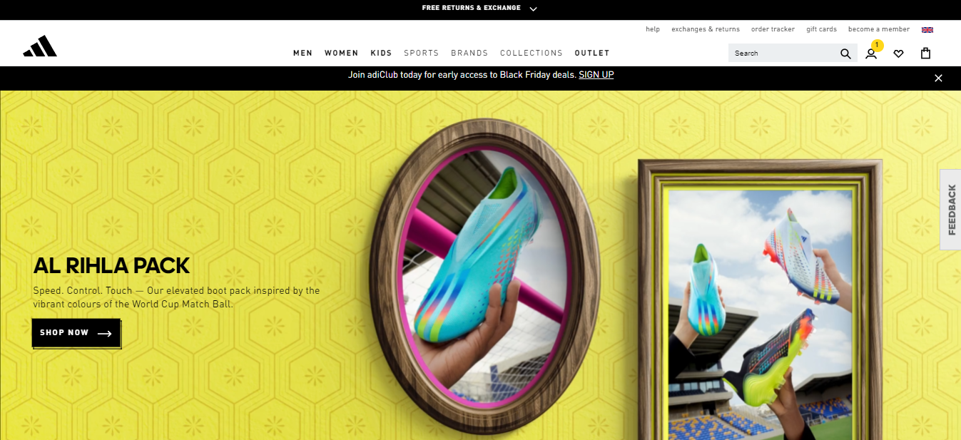
The homepage of the Adidas website shows off its products in a powerful and memorable way by using proportion:

Repetition
Some of the best designs use only two colors or keep repeating the same word.
It may seem like the oldest trick in the book, but repetition is powerful and can be used to show many deeper ideas (check out this 2008 Penguin edition of Walter Benjamin’s “The Work of Art in the Age of Mechanical Reproduction”:
The ux design principle repetition is used on the cover of a green book with the same title.

Repetition can also be thought of in terms of consistency and brand identity when it comes to UX design. Switching between fonts and color palettes that have nothing to do with each other may seem radical and fun, but it can confuse users and turn them off.
White spaces
Last but not least, don’t be afraid of blank space. Many of the tricks and tips we’ve talked about so far wouldn’t be possible without it.
By using white space, you can give your elements room to breathe and experiment with alignment, balance, contrast, and movement. White space is an important part of UX design. Without it, things can look too busy and overwhelming.
White space or “negative space,” which is the space between and around an element, can be a stroke of design genius in the right hands. Look no further than the famous FedEx logo to see this in action:

The FedEx truck is white, and the FedEx logo is in the white space.
The cover of “Why I’m No Longer Talking to White People About Race” by Reni Eddo-Lodge is another famous and modern use of white space.
Why I’m No Longer Talking to White People About Race has a white cover with black and white text.
Key takeaways
Design principles are important to keep in mind when making a UX, because a bad design can make users confused, lost, and disinterested in the product.
A good designer knows how to use these principles together in ways that reinforce, support, or even clash with each other to get the effect they want.
The design principles give us a lot to think about and a lot to think about in how we do things. Here are some important things to remember as you move forward in UX design:
The world of design is important to how we use products, interfaces, art, and our own things every day.
Good design is actually based on a clear set of rules instead of being a free-form creative space.
To make a design that looks good and works well, you can use alignment and balance, contrast, emphasis, movement, proportion, repetition, and white space.
A good design isn’t just pretty—it also has to send a clear message, and this message needs to stand out.
This is the same set of rules that UX follows.
Don’t be scared of things like repetition, simplicity, or blank space.
Don’t worry that you might break the rules.


