Philippe Hong
Category: Virtual Reality
Today we’re going to talk about Virtual Reality, yes, the trendy thing everyone is talking about. Oculus Rift, HTC Vive, Samsung Gear, all that kind of stuff. But we’re going to talk more specifically about User Experience and User Interface in VR, and for everyone’s concern, User Experience and User Interface in VR are completely different than in normal web interfaces. It’s an interesting subject and I hope this will help you to start designing for this new and exciting technology, which is VR. The subject was presented on by Vivid N. Savitri during the Immersive Hack Hackathon in Sydney. She’s a videogame and user experience designer. She formerly worked for Atlassian, Frog Design and Trigger (acquired by Sony Entertainment) and and recently founded her own startup.
1. Where and how to start
Learn how others do
First of all, before you even start thinking of designing for VR, you need to test drive the VR experience, to understand how it works and how it feels. Buy your first cardboard, it’s very cheap. And then try as many games or demos as you can. This is the only way you can really understand how it differs from the desktop experience.Decide what experience you want to create
This step is very important and it doesn’t need to be overkill. Try to focus on what you need as a MVP and start from that. Is your game/app a FPS? Or third person? Where are you in the VR world?Illustrate the user flows
What happens when people go into your app or game? How does is start? From the mobile? Desktop? Beyond the user experience for business application, you need to care about: “What makes things fun?” And this is true for normal application as well. Make it intuitive and don’t forget that something great means people forget about the controllers.Sketch various UI and HUD options
Don’t reinvent the wheel. It doesn’t mean you need to lose your creativity. Users have already learned and know subconsciously, some design interface principles. Try to use that to your advantage so you can focus on solving your own problem. Icons and Terminology are a couple of examples.2. Design tools
Pen and paper
This is a basic tool but sketching is an important part of the design process so you can focus on solving the problem. Then when it comes to designing onto tools like sketch or figma, you’ll start to think about design and look & feel. Try to focus on one thing at a time.Sketch or other design tool
This depends on what engine you are going to use to build your app/game. If you are building a 3D Game, then use the app according to your need. It’s also a good way to start learning a new tool. Don’t restrict yourself to what you know. Try new horizons.3. Framework to use
Mozilla A-Frame (Web VR) e.g: Google Cardboard, Samsung Gear, Oculus Rift Daydream VR (Mid range VR google) e.g Mobile (Daydream ready only) Unity VR, Unreal SDK (High end VR google) Unity Asset Store e.g Oculus Rift. HTC Vive, FOVE, Holelens (AR), etc. If you know of any new framework, please feel free to comment to add it to the list. [wp_ad_camp_2]4. Experience Principles
Comfort
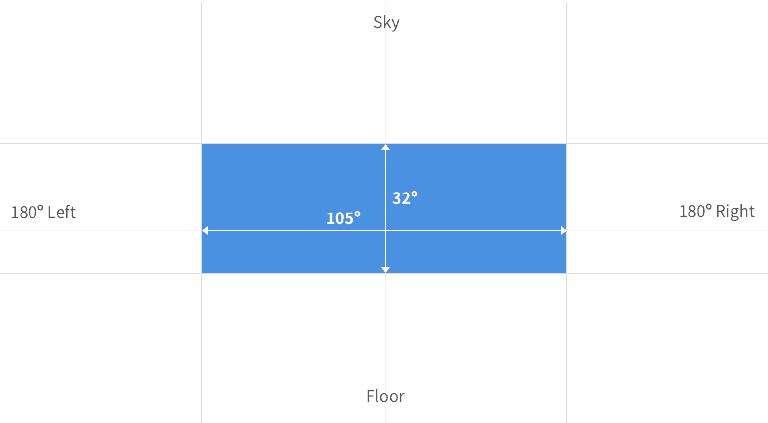
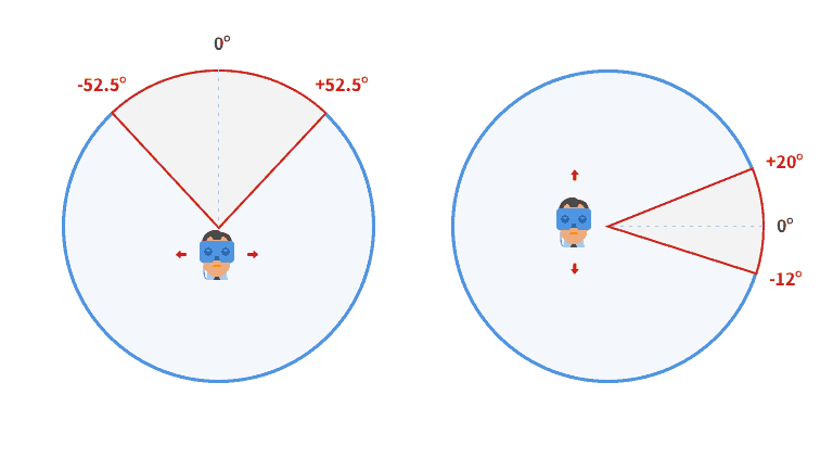
Comfort is the next evolution of the user experience, especially after 45 minutes. You need to avoid creating headaches for the user when using your app or game. VR is a very strange experience for your brain because your brain sees that you’re moving but in reality you’re not. Poorly produced VR can make you very sick but there are ways to minimise the motion sickness by using teleportation instead of animating the user from point A to B. Here is a simple schema showing the user comfort zone:
Example of Comfort Zone
Translated to Immersion

Immersion measure in degree
Interface
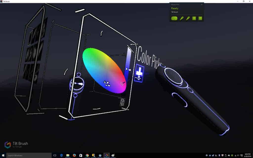
Obviously, you can’t put the interface in front of the user so imagine the user being a part of a world with the interface immersed and not simply sitting in front of the user. It is also important to consider layer depth in VR.
Depth Layer in VR
In terms of pixels, this can be an example:
VR in term of pixel on the screen

Control Menu in 3D on Tilt Brush


